-
×
 ExtensionBlock
1 × $ 12.52
ExtensionBlock
1 × $ 12.52
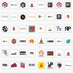
Take a Look at all Logo Submissions
19
Jun
Jun
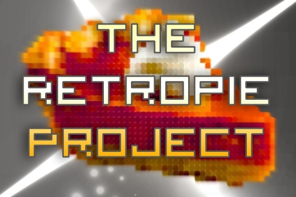
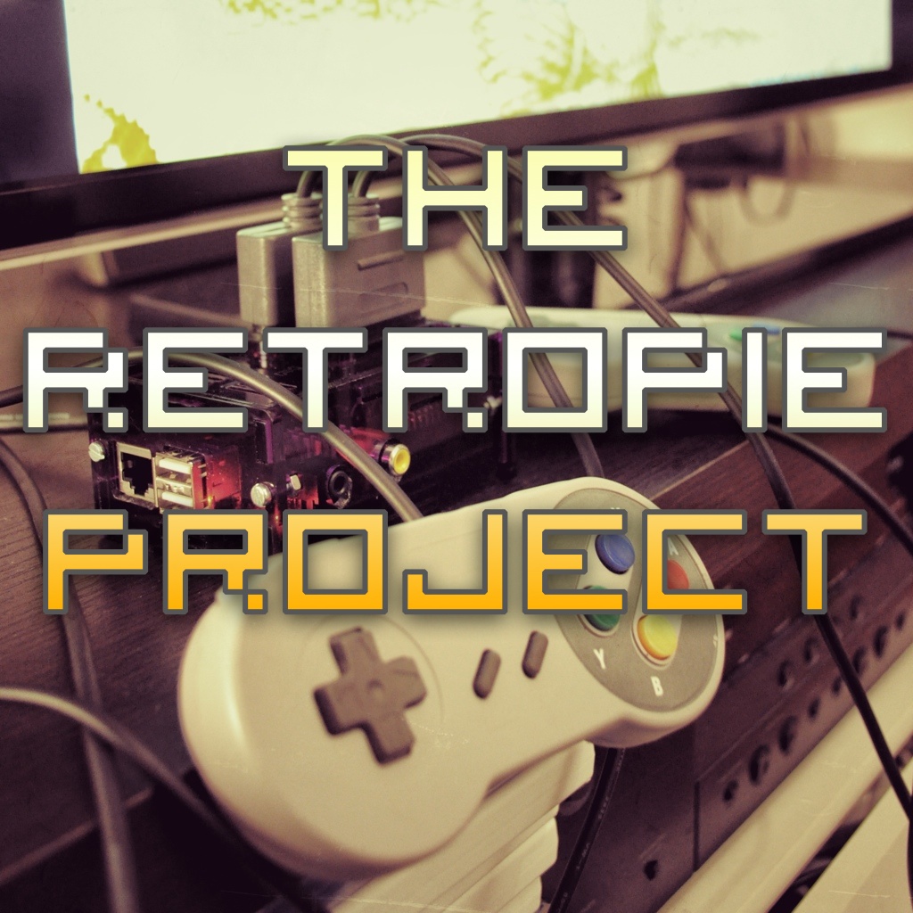
With the announcement of the logo for the RetroPie project many people have asked for publishing all submissions to look at and give their opinions about them. So, here they are – all 84 submissions that we received. You will notice that the current iteration of the RetroPie Logo is additionally shown. Also, you have the possibility to vote for a single submission that best suits the RetroPie project in your opinion.
What happens with the result of the vote? You understand that this vote is an experiment and we cannot promise to strictly use the top vote in any case. And remember that you can easily customize the splashscreen and theme of your RetroPie installation.
We hope that you can enjoy and maybe even get inspired by the following works. We are curious about your opinion now:
[total-poll id=”99525″]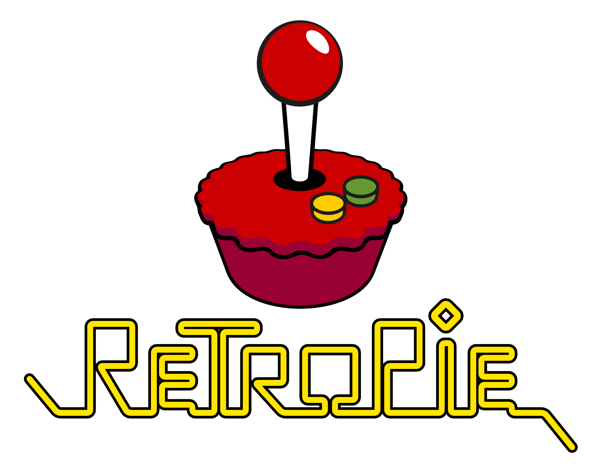
The stuff you have published is quite authentic and helpful for new and inexperienced designers.
Not that it does anything to limit my experience in enjoying my retropie, but I agree that that chosen logo looks childish and also like a cupcake and think it should be put to a re-vote sometime soon. The great thing about retopie though, is that I can use any of these logos to make my own splashscreen.
No offense, but the cupcake logo looks dumb. More retro. Less “Pie.” I voted for this:
https://www.petrockblock.com/wp-content/uploads/2015/06/37.jpg
Runner up:
https://www.petrockblock.com/wp-content/uploads/2015/06/2.jpg
Honorable mention:
https://www.petrockblock.com/wp-content/uploads/2015/06/45.jpg
or one of it’s variants…
Thanks for showing all the logos, guys. I’m sure it took a considerable amount of effort to get all of these together!
I’ve enjoyed seeing what everyone was able to create! There are definitely a lot of very creative people out there in the RetroPie community, and seeing the range of different ideas is fun and inspirational.
Damn… how did we missed this contest!
We love RetroPie and arcade gaming – and designing a logo for RP… that would be something. That’s toooo bad.
We’ve recently designed a logo for ATTRACT MODE, a front end for mame. You can check it out here: http://tinyurl.com/ClanLogoDesign-com-intros
Wow! Looks really cool and retro!
thx. too bad that we’ve missed that RetroPie logo competition :(
Why not a slice of raspberry pie, RetroPie?
The new logo looks like a cupcake :P
I want more retro, less pie :)
I agree, more retro, less pie would be great! The logo that was picked has a childish look to it.
Well, to be honest I think the best logo was already chosen.
I think it could be because of artificial limitations (i.e. “don’t use obvious stuff”) – even though the winner is pretty much a retro console made out of pie, not sure if that qualifies as “obvious”, but anyways..
The other one that I really like (perhaps even more then the winning one) is this – https://www.petrockblock.com/wp-content/uploads/2015/06/48.jpg
Looks very tidy and I dunno why, but I just an’t help and feel “comforted” by it.
Among the winning logo variations, I think this one is the best: https://www.petrockblock.com/wp-content/uploads/2015/06/74.jpg
However the writing does not look good and definitely not gonna scale. We need to work on it some more to make it perfect!
well done everyone, all look great!