RetroPie has a Logo
First of all, let me say that we were overwhelmed by the number of logo proposals that the community has submitted. Thanks to all of you for your creative efforts!
The logo contest ended a few weeks ago and we did not take the decision process for a winner easy. After several rounds of weighting pros and cons, discussions, having slept on it for a night or two, filtering out some more logos and starting the process from the beginning, we finally came to a conclusion.
Update: In the following we show the logo after another iteration on the design.
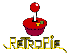
We are happy to present you the RetroPie Logo:
Also, here it is in black and white as well as part of a splash screen:
It mixes the ideas of a pie and the retro-gaming aspect in a neat way. The designer of the logo is Garry Marshall, congratulations!
Again, thanks a lot for all your great submissions! It made us really proud.
The various RetroPie Logos by Florian Müller are licensed under a Creative Commons Attribution-NonCommercial-ShareAlike 4.0 International License.



great logo – how do i get the work-file of that logo – black/white needed. i want to plott/print a sticker for my case. that png file cant be handled well because ist not vector-based and only colored in the download section :-( quality is bad in the end on the sticker. thanks for a link!
I have added an SVG download now. You can find it on the download site at https://www.petrockblock.com/retropie/retropie-downloads/retropie-logo/.
People, I have followed your comments in the last days and, to be honest, I did not expect such emotional statements about the project logo here. I would like to share my thoughts with you in the following:
– I do not like the mood in this comments thread. The maintainers of the RetroPie project — me included — are solely doing this in the spare time and enjoy sharing and further enhancing their work with others.
– I do not like that people get offended here: “But this logo is rubbish”, “This is just an insult”, “I fail the judges …” are all statements that hurt people, sorry — I have to get that off my chest.
– I do not like that I underestimated the difficulty of evaluating logo designs.
– I do not like that I misjudged the advantages of a public vote for logo submissions.
That being said: If the RetroPie community is calling for a public vote I want to support that. With the amount of critical feedback I offer to present you all submissions (85 over all) for a public vote shortly here. The community votes and, if the votes are not too close to each other, the top logo wins. Otherwise we can have another vote for the top ones. Garry Marshall will keep the prizes in any way. I want to settle this and a public vote is a transparent way for getting a consent for this project.
What do you think?
Well, I’d like to apologize if anything I said was hurtful to Garry or to the RetroPie team. I certainly didn’t mean for it to come off that way, and I, for one, wasn’t personally insulted that my work didn’t win. These things happen.
This is just my opinion, but I’m not sure if a vote is a great idea at this point. Replacing the winning logo with someone else’s work wouldn’t feel good for anyone. If anything, I’d take the winning logo (along with whatever *constructive* input the community might have about it) and iterate on it. It’s not a bad idea/design – but (again, in my opinion) it could be better.
I think at the end of the day, we all just want to boot up our Raspberry Pi’s and enjoy the work you guys have done with the RetroPie project. If the first thing we see is a refined version of the winning logo, I’m all for that.
As someone who spent nearly two weeks preparing my submission, sweating the details, doing anonymous testing to get reactions, etc., I really like the new logo concept. It’s not perfect, some details bother me a little… like the left/right edge of the crust where it meets the base. My OCD notices the off-pixel stuff and odd choice of some vector objects. But I can live with it. It’s decent enough to be a winner IMO.
If I ever get bored of it, I can always create my own splash screen and swap out the SVG with my own submission. I don’t think a public vote is necessary.
I think a community vote is necessary, not that I have anything against the logo or the artist, just that, we never got a chance to look at the entries and give our opinion. In the end, it’s just like how Martin put it. We love to boot up our favorite projects and have fun. I would like to see the entries, and maybe make a startup video for the fun of it. Here’s what I had fun doing.
I entered the contest knowing there was little statistical chance of winning. I am not upset I did not win.
I have three thoughts on this matter:
1. The winner has been chosen by the team who decides the winner. They looked at them all and chose the one they liked the best. Criteria met. Done. Its a subjective decision.
2. It would be nice to see all the submissions in any case. Its a community – lets have some fun and see what other people thought. Transparency is great. Personally I’d find it fascinating to see all the different designs.
3. Its quite possible the existing winning design (and in fact any chosen design) could do with a little adjustment. Surely there’s no problem with that. A few submitted tweaks and the design will polish up very nicely. We could do that, couldn’t we ?
On a personal note – and this may come of rude but some of you could do with moderating your thoughts before posting. Just in a general “rule of thumb” kind of way. Its a public forum. I know its a Retro Pie but what are we all, 12 ?
Personally I think 84 is too many to choose from- as the head guy here, I think it would be a good idea for you to pick what you believe to be the best 10 or even 20, then let the comminuty vote on them.
We need all 84 in the mix. We can dwindle the numbers down publicly from there. If we’ve collectively disagreed on the winning choice, what’s to say that what someone thought was #21 over all isn’t a top 5 design by general public standards.
I’m going to be pretty certain that it’ll be easy for everyone to come together and figure out a winner.
I apologise to saying rubbish etc. Bit harsh but I stand by my intension that it shocked me as a designer to see that work as the winner. I see better examples bellow. I’m sorry to you for offending you. But I stand behind your decision now that I have expressed my honest opinion. Honesty is important even if not to everyones liking. You have made your decision and I stand by it and suggest not polling it now that it’s been decided. Better option from here would be to use it as a reiteration. Work with the winner to develop the next iteration and build on what you have. I honestly didn’t see it coming even though it does seem obvious at this point. We can all learn.
I would have proffered to have had a community poll as the judging method at least as a short listing for the judging. But it’s past now and to do so is an additional insult to the winner.
I guess you can take the emotion as a sign of where your project has gone. It has become a community and people have taken it onboard as part of their lives and they are standing up for how they feel about things that happen. Perhaps when you ask an open question such as; design me a logo for free and maybe I’ll use it. you can understand that putting it into that communities hands that they feel apart of it and wish to continue to be apart of it. It’s a lesson learned maybe?
And as others have said I honestly congratulate the winner. The logo will work in the long run. I personally would tweak it a bit. Simplify where one can simplify generally is a rule of design. Maintain the design language within the work is another. Not a fan of the green but, yes it’s again as is everything, my opinion.
I would support a community vote, if it would help smooth things over – and if people would accept the result. I agree with you regarding the strong comments on this thread – over the top, and not needed. Hopefully Garry won’t be disappointed if a vote is made too.
All this reminds me of when XBMC renamed to Kodi and changed branding – I guess pleasing everyone is impossible.
And if your logo isn’t chosen – don’t get upset. Your contribution is still appreciated. petRockBlog also puts hours and hours of his time into this – and sometimes as a developer the first feedback we get is “it doesn’t work”. We are all in this for fun – try and enjoy yourselves :)
Some of us are trained for this kind of work. It’s extremely irritating seeing all the RUBBISH design in the world. I will not apologise for standing up for a world with more quality work in it. But as said bellow I do apologise for offence.
I think it’s fair to say that everyone is appreciative of what you guys do here. I certainly do, I just am an extremely critical person. I work in the design industry and I hate 90% of my own work by the time I’m finished. I’m critical because too many people, especially non designers, are impressed with work simply because they are not capable to doing anything.
In this case, only because I’ve been impressed with some of the other designs that were shown, am I critical of the way it was chosen. People rely to heavily on the use of a ‘Pie’ because of the name, but when you look at the designs who will be highly regarded amongst the public, you’ll likely see a lack of ‘Pie’ elements. It’s too force, has nothing to do with gaming and is only in the name because of the hardware.
The mushberry is still in my mind a great logo, I’m not sure why that has never been up for grabs, I realize criteria was not to focus on 1 console, but come on, Nintendo, hate it or love it, is synonymous with retro gaming.
I appreciate you stepping up, and will apologize for any negativity directed towards you, but it should show how much people like Retro Pie and want only the best for it.
I appreciate your thoughts, I love the mushberry logo and will still probably use it personally regardless of who wins but the reason it can’t be used for the retropie project is because its a mash up of two trademarked logos and the legal integrity of the retropie project is necessary in order for it to continue. In short the retropie project cant risk being sued and also as far as logo criteria the RetroPie project probably would prefer to maintain some sense of generality as you said.
It would be cool if the logos could be added to the project as a “start screen” collection that could somehow be selected via preference. Let the official logo be the default start screen, but if people would like to change, they could do so without adding it “under the hood.” I’m guessing it would be difficult to build in, but I think it would be an appreciated feature.
Here’s the design plan I submitted to the contest. Honestly I’m impressed by the designs we’ve seen in the thread and I don’t envy the team that had the task of narrowing from 84 to one. I’m good with however they’d like to handle the situation. After all, it’s their project we all enjoy!
We do need a vote. Not strictly for personal reasons as much as for respect of all the other contestants and the hard work they have put into this. My experience tells me that yes, all people have VERY varying opinions, but if if enough people vote (it does take quite a few…), the best design seems to win 99% of the time.
Public vote, yes please!!! (all 84 of them)
I think that having the community vote is a way everyone can feel included,
With all the respect to Garry and his hard work- your contribution is greatly appreciated.
Some have suggested randomising the 84 splashscreens, which could be easily accomplished with sur0x’s tool https://www.petrockblock.com/forums/topic/splashscreen-randomizer/ or again if some people are not satisfied with the end choice (which there will always be someone) that is the great thing about this project is that you can customise it to your own liking without putting anyone down.
@petrockblog:disqus Thanks for setting up this project and all your hard work.
I have posted all submissions in another blog post now at https://www.petrockblock.com/2015/06/19/take-a-look-at-all-logo-submissions/.
I don’t honestly expect to win. But this logo is rubbish. So sorry to the winner for saying that. Think of it like a flag, It has to be quick to recognise (does that) easily memorable and associated. Not without the text. Scalable. Not really, details is lost and resolution of the details are inconsistent. Not a cliche, fail there. Use text or icon. Not both. I think the text was fine, but using text is a bit of a half ass as a logo generally but most associated. Icons that fit a circle or perhaps a square are most usable. I commend the people who entered and it would be nice to them all. And I do congratulate the winner for his efforts. I fail the judges for their lack of design skills and foresight. As said bellow. a community aspect to this would have been more likely to give you the proper shortlist to judge from.
Really great to finally see the great work of the community. The problem we’re dealing with is apparent from the very beginning of this contest. If you, as you say, aren’t logo designers, then how could you accurately judge the designs? I know this is stretching it a bit, i work for customers that judge my designs constantly. But i would actually go out on a limb and say that a vote instead would have made Florian Müller a lot of money. This is not only a non-profit project. Good logotypes make money, bad ones deter from interaction with the subject matter in the first place.
With that said… well… here’s my contribution. Great work guys!
You win. Like it’s not even a contest at this point. The simplicity of this, the font choice, the colours even. Well done. I would actually rock that t-shirt.
I know it’s called ‘Retro Pie’, but there really needs to be no relation to an actual pie, since the connection is the system it is ran on.
As far as the other people who have posted their designs on here, all great pieces.
Eddi – Colour selection is nice, but I’m not really the overall look. The font choice doesn’t do much for me, I like the sprites in the there, but it might have been executed better on a different font. The pie at least looks like a pie, but it also needs work. Either go smooth, or go jagged, but mixing the 2 isn’t working, though this logo could have been shown to the public and collectively could of been improved.
Martin – Your 2nd set nailed it. Very clean, retro feel to it. Would of taken all 3 of your submissions over the winner if we’re being honest.
Roxima – Cool concept, colors are spot on and fond choice works as well. The subtlety of the joystick is great and I could of easily seen this as a logo to a 70’s console.
Cole – I really like this logo, I just would of preferred a slightly thicker font. Probably a different font all together, but still a nice design. Simple and clean.
Again, congrats to everyone, I didn’t submit anything so I’m sure my opinion is void, but as a person who deals with design daily, I hate when people are amazed by a design simply because they cannot do anything in Photoshop. As stated, if you’re not a designer then take a vote, otherwise you end up with unhappy people.
Also I should again congratulate the winner, don’t take what people say personally, you did what you were asked, and any backlash is on the process of how the logo was chosen, and that has nothing to do with you.
I suggest you give Garry the prize, but use Lars’ logo, or at the very least consider going to a public vote, because this backlash can’t look good right now.
Thank you for the compliments, i made the typeface from the ground up and even offered them to make a proper typeface of it for use in headlines etc.
It looks nice, if you’re selling industrial machinery, I can see why you like it, but it says nothing about gaming, it’s too corporate.
The font looks a lot like the typeface Phosphate solid and inline. I did have exactly the same idea myself but rejected it after doing some research, it seemed a little obvious.
http://www.redportinternational.com
http://www.trademarkia.com/rp-85946670.html
How many logos out there capture gaming in a strictly graphical sense? Nintendo? Namco? Razer? Steelseries? Nvidia? AMD? SNK? Playstation? XBOX? X-Arcade? Alienware? Steam? I can’t seem to find any… You can’t expect the typeface to represent gaming in an obvious or childish way. I followed the guidelines. What i DID try to do was to make it TRUE retro by using retro aesthetics. Industrial machinery… *chuckle* :-)
Some more examples-
http://topshelfcreative.com/portfolios/landwise/
http://right-progress.tumblr.com
http://www.rpdrawings.com.ar/about/
well, you win. I’ve been looking high and low, and still can´t seem to find a logo of a cupcake with a stick and two mints on it. Truly original and awe inspiring work!
You may be a good designer, but your attitude stinks. I think you’ve already said enough regarding the logo choice. Please can you leave it now.
The best way to check the effectiveness of a logo is to create the standardized icon sizes of it (16px x 16px; 32px x 32px; etc.). It’s nice to say that this logo was selected because of its ease of colors, but those tiny edges where the base meets the top and the small spaces on the font will not scale very well. If this is the final design, then I feel it should go under some revisions before it is finalized to get the best look for this. I am quite fond of Mario Maldonado’s logo (with adjusted spacing for the ‘i’ stick in pie). I’ve included my submission in case you’re curious.
Looks more like a muffin to me. Or a birthday cake with a candle in it.
Based on what I’ve seen in the comments, there were definitely better submissions. The colour of the winning logo is horrible and the font is just terrible, which is such a shame as I’ve followed this project since before it reached version 1.
A logo whether you or I like it or not does not make a project bad. If we disagree with the judges decisions it does not mean the RetroPie project is a let down. It makes no difference to the quality of their work where it matter most.
First off I want to congratulate the winner. However, a public vote should of been used to determine the winner. The idea for the logo is there, but the execution is meh.
The font is horrendous, even if you choose to use the other part of the logo, the font needs to be overhauled (one big reason why a public vote would of helped, criticism on certain aspects could have been taken into consideration so that a logo everyone can be happy with would be unveiled.)
The colour is not a great choice, doesn’t feel retroish, the b/w version looks alot better then the turquoise colour.
As far as the main part of the logo goes, the idea is there, but it needs a fair bit of work. The ‘pie’ doesn’t look like a pie, everyone will agree on that. The stick is also far to large in comparison to the rest of the logo and this is just being overly picky, but a ball style knob should go with larger buttons, where smaller buttons would just be a stick with no ball on the top. That doesn’t take away from the design, but a few small things to kind of tweak.
The other big thing I believe is that the image should be pixelated to represent retro gaming.
I would of liked to see all of the designs voted on by the public, I think that there is a possibility that we could of mixed ideas from a few designs to come together as a community and create a great logo that everyone can be happy with, instead we get a good idea, and a whole lot of backlash.
Again congrats to the winner, this isn’t to take away from what they’ve done, they came up with an idea and put it out there, it’s just that we could of fixed small little things before launching a logo to the world.
yep
Congrats Garry! Here’s mine if any one is interested
Congrats to the winner! Kinda bummed how it turned out. Oh well, I would like to share my logo entry, if anyone is curious. http://darkroxima.tumblr.com/post/120653743380/this-was-my-entry-for-the-new-retropie-logo
Hey, nice work Mario! Even goes pretty well with the background on your tumblr, hehe.
Thanks! Lol. Yours is amazing too! My fav is the second row, second column.
No problem – and thanks for checking mine out too. Glad you like them! :D
I love this logo. I think if the spacing on the joystick ‘i’ and the line under the ‘e’ was more evened out, then it would be perfect. Good job!
Well, I’m disappointed that I didn’t win – congratulations to the winner, of course.
I have to echo some of the concerns of others here though. The typeface used in this logo is very hard to read at just about any size. And I think a lot of us avoided using any kind of pie/cake/pastry elements in our designs specifically because the instructions said to “avoid the obvious”, and that makes it especially disappointing to see a logo win which seems to have ignored this bit of the instructions.
Ah well… so it goes. Thanks for giving us the chance, at least.
2nd concept, 4th reiteration looks amazing!
Thanks, Eddi. I liked your submission as well – it definitely has that retro vibe.
In mine opinion the logo is cool, but i dont like few things:
COLOR – that greenish color isnt so cool
TEXT – yeah, cool, but if you are making a sci-fi game. I think RetroPie text should be pixelated or something ;)
joy on “cake” – Cool idea with that, but it could look like an cherry on cake, not exactly like joystick.
CAKE – dont know why, but i think that is a cupcake, exactly like Lars Thun. ooh, man.
But gg is going to Garry Marshall, i see you have made a good thing!
Text or Icon. Not both.
Btw. Congratulations Garry Marshall, you´re a logo designer now!
Just need to clarify… I was perhaps a bit upset when i wrote this. I do NOT want to come off as a cynical prick, i have full respect for the time and effort you put into this, Garry. Everyone has their own style, no matter what people think, most designers really put a lot of heart into their work. Congratulations Garry, i mean it.
How is this even considered a usable logotype? To quote yourself, “Avoid clichés or the obvious.”. How’s that going for ya? Huh? I took the instructions SERIOUSLY and put in hours upon hours in my version. This is just an insult. You should have had a public vote in the forum. Sorry, just slightly upset… wondering how the h*** you´re going to use this in a serious manner.
Yep
Looks awesome, but wouldn’t it look a tad better if the bottom had a bit less depth? It looks more like a cupcake than a pie.
Depends on the country I guess – UK pies are usually deep (such as pork pies)
I think the rolling shape of the edge is more cupcake like – Like it was made in a mold. Versus a pie, which is made in a round dish and might have a scollaped edge on the top crust. Seldom from the mold. Sweeping generalisation I know, but I’ve eaten pies from lots of countries :)
Of course the meme is cupcake with a candle on top, and that’s influencing it also.
A slightly flatter pie, or less of a perfectly rolled edge would emphasise pie rather than cupcake (perhaps) :)